Scroll to:
Basic principles of descriptive statistics in medical research
https://doi.org/10.47093/2218-7332.2021.12.3.4-16
Abstract
Descriptive statistics provides tools to explore, summarize and illustrate the research data. In this tutorial we discuss two main types of data - qualitative and quantitative variables, and the most common approaches to characterize data distribution numerically and graphically. This article presents two important sets of parameters - measures of the central tendency (mean, median and mode) and variation (standard deviation, quantiles) and suggests the most suitable conditions for their application. We explain the difference between the general population and random samples, that are usually analyzed in studies. The parameters which characterize the sample (for example, measures of the central tendency) are point estimates, that can differ from the respective parameters of the general population. We introduce the concept of confidence interval - the range of values, which likely includes the true value of the parameter for the general population. All concepts and definitions are illustrated with examples, which simulate the research data.
Keywords
List of abbreviations
- CI – confidence interval
- IQR – interquartile range
- SCr – serum creatinine
- SD – standard deviation
- SE – standard error
One of the most famous and influential statisticians of the 20th century Ronald Fisher wrote in his work ‘On the mathematical foundations of theoretical statistics’ that ‘…the object of statistical methods is the reduction of data. A quantity of data …is to be replaced by relative few quantities which shall adequately represent the whole’ [1]. This quotation perfectly reflects the essence of descriptive statistics, the branch of statistics devoted to the summarization and description of data, which provides tools to explore data sets and illustrate the data. Medical research can combine data from hundreds or thousands of observation units (individual patients, animals, cells, or other objects) that cannot be understood individually. However, researchers are usually interested in a limited number of parameters (for example age or smoking status), which can be summarized and illustrated using the principles of descriptive statistics to get the impression about the whole studied sample. In other words, we aim to express the properties of the entire sample with several measures or one figure.
Data exploration and summary is the first and one of the most important steps in statistical analysis. The aim of this step is to describe and summarize the collected data properly to understand their features. As a result, scientists identify a suitable parametric model, which describes the distribution of the data. This phase is crucial because this model defines further approaches to the testing of statistical hypothesis. Thus, the main aims of descriptive statistics are to explore the research data, identify data distribution, detect errors, and reveal unusual values (outliers). Descriptive statistics also helps to assess the proportion of missing data and bias. In general, an adequate and clear presentation of the data indicates that the researcher has collected, analyzed, and interpreted them correctly.
The aim of this tutorial is to present the basic methods of data description for different types of variables, including their graphical presentation.
General population and random samples
One should keep in mind that we usually analyze a random sample derived from the general population, for example, a group of patients with myocardial infarction, randomly chosen from one or several tertiary centers. However, when we analyze the sample, we aim to make some conclusions about the general population (in this example all real-world patients with myocardial infarction), which cannot be analyzed directly. Each value calculated from the sample is an estimate for the population parameter (for example, arithmetic mean of some parameter in the sample is an estimate of the population mean), and they are called point estimates. Since point estimates are inferred from a random sample under some uncertainty all our statements will be probability statements. To better understand some concepts presented in this article we recommend that you recall the basic definitions of probability theory and set theory presented in the first tutorial [2].
TYPES OF VARIABLES
In statistics a variable is a characteristic that describes the studied object (patient, animal, cell line etc.) and can take different values (‘vary’). The choice of variables depends on the study objectives. Exposures and outcomes are also variables from the statistical point of view (more on exposures and in outcomes in different study designs in the previous tutorial) [3]. The examples of variables include sex, age, concentration of a biomarker, gravidity (number of pregnancies), tumor grade, history of smoking etc. The initial step of any experimental analysis includes the selection of variables and assessment of their measurement scale. There are two main types of data – quantitative and qualitative (Fig. 1).

FIG. 1. Types of variables.
РИС. 1. Типы переменных.
Quantitative variables (numerical, metric) can be measured numerically, or in other words their magnitude can be represented by a metric scale, for example, they can be counted or measured in meters, kilograms, mmol/L, or any other units. Quantitative variables are classified into continuous and discrete variables.
Continuous variables can take an unlimited number of values between any two points of measurement, including whole numbers and fractions. For example, weight, bilirubin concentration, and body temperature are continuous variables.
Discrete variables can only take a limited number of values, that are usually whole numbers. For example, number of disease relapses or number of cells per high-power field of the microscope are discrete variables.
Qualitative variables (categorical) cannot be measured, instead they are classified as categories. For example, hair color cannot be measured on a metric scale, but it can be classified into several groups (categories): black, blonde, red, etc. Qualitative parameters can be further divided into ordinal and nominal.
Ordinal variables are ordered according to a rank. For example, tumor grades are not measured on a metric scale, nevertheless higher ranks represent more severe disease.
Nominal variables are unordered (for example, place of living, occupation, etc.). One of the most common types of nominal variables are binary variables (dichotomous) that can only take two values (developed the studied outcome or not, survived or died, male or female).
Sometimes statisticians use additional classifications for different variables, that are not described in this review. The details can be found in textbooks on biomedical statistics [4].
SUMMARIZING CONTINUOUS DATA
Data distribution and histograms
As we have already mentioned the aim of descriptive statistics is to describe some data that are usually derived from a random sample of patients (or other observations). Each parameter can take different values, and the scientists are usually interested in the assessment of probability of each outcome.
First, we can visualize data distribution. We need to sort all observed values in the ascending order and group into small ranges (intervals) of the same size, called bins or class intervals. Then, we count how often the observed values fall into different bins in the studied data sample. Graphical representation of this method is called histogram. The width and the quantity of bins depends on the range of values that are grouped into a bin. The less the range – the narrower are the bins.
For example, we measure serum creatinine (SCr) level (mcmol/L) in a random sample of 20 patients. The results ranging from the lowest to the highest are the following: 133.5; 133.8; 138.0; 138.2; 139.3; 142.2; 143.1; 144.1; 145.0; 149.0; 149.1; 149.3; 151.0; 151.9; 152.5; 152.8; 153.4; 153.8; 158.7; 158.9.
Each blue bar on the histogram presented in Figure 2 represents a bin (a small range of SCr concentration on X-axis). The height of each bin represents the number of patients with SCr concentration inside the bin concentration range (Y-axis). As you can see, there are two patients with SCr level between 130 and 134.9 mcmol/L, three patients with SCr between 135 and 139.9 mcmol/L, three patients – with SCr between 140 and 144.9 mcmol/L etc.
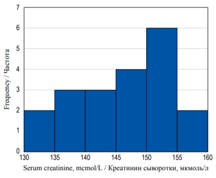
FIG. 2. Frequency histogram of serum creatinine concentration distribution.
РИС. 2. Гистограмма распределения частот концентрации креатинина.
Usually, we want to assess the probability of a patient having some random SCr value (call it X, for example) within our range of concentration. However, frequency histograms only show the counts of each outcome, but not their probability. To access this probability, we need to construct a probability
distribution. We need to normalize the histogram by dividing the count in each column by the number of observations multiplied by the class width. The resulting plot is called the density plot (Fig. 3). The shape of the histogram has not changed, but now it demonstrates probability density function, and the area of each bin (column) is equal to the probability of some event (basically SCr concentration taking the value within some interval). The area under the whole histogram (in blue) is equal to 1.0 (100%) as it equals the sum of probabilities of all possible outcomes in the sample space. It should be noted that the Y-axis values do not indicate the probability, and we should measure the area in each bin instead.

FIG. 3. Density histogram of the serum creatinine concentration with a probability density function (red curve).
РИС. 3. Гистограмма распределения плотности вероятностей концентрации креатинина сыворотки с функцией плотности вероятностей (красная кривая).
The area under the histogram is equal to the sum of areas of all bins. And as the width of each bin is equal to 5 and the height can be derived from the values on the Y-axis, we can calculate the area (S) under the entire histogram to check our previous definitions:
S = (0.02×5) + (0.03×5) + (0.03×5) + (0.04×5) + (0.06×5) + (0.02×5) = 1.0.
It is equal to 1.0 (or 100%). We can calculate the probability of any given event (in our case the probability of SCr value in a certain interval) in a similar way. For example, the probability of obtaining the value between from 130 to 134.9 mcmol/L is equal to (0.02×5) = 0.1 (or 10%). Similarly, we can calculate the probability of obtaining SCr concentration of less than 145 mcmol/L. It is equal to the area of bins from the lowest value to 144.9:
(0.02×5) + (0.03×5) + (0.03×5) = 0.4 (or 40%).
The example above only describes 20 individual observations, but in clinical research a scientist often analyzes extremely large samples of continuous values. In large samples we can choose finer intervals for each column – as a result the histogram becomes smoother resembling a curve (Fig. 4). Area under curve can be found by making a definite integral between two points on X-axis, and it will be equal to the probability of an individual measure (observation) to fall into the predefined limit between these two values. Hence the finer the interval we take, the smaller the probability will be of the SCr concentration falling exactly within these limits because the area under the curve will be smaller.
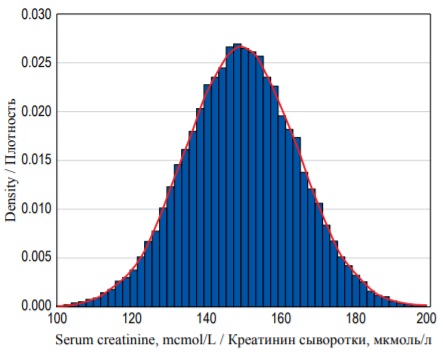
FIG. 4. Probability density distribution for 25 000 random observations of serum creatinine concentration with a probability density function (red curve).
РИС. 4. Распределение плотности вероятностей для 25 000 случайных измерений концентрации креатинина сыворотки с функцией плотности вероятностей (красная кривая).
Numerical description of continuous data distribution
Histogram demonstrates distribution of the values graphically, but it can also be characterized numerically. There is a set of parameters that describe different cut points of the data distribution.
Quantiles are cut points that divide the entire range of values (probabilities) into equal intervals. In the example with SCr, more than 10% (0.1) of values are located below 135 (or in the other words the probability of a value to fall into the interval below 135 is 10%). Thus, 135 is a 0.1 (10%) quantile. In the same example 145 is a 0.4 (or 40%) quantile.
Some quantiles have special names that are used depending on the number of intervals created. One of the most common types of quantiles are percentiles (100 intervals, or in other words the probability given as percentage). Percentiles are often used to describe population statistics in medicine. For example, the phrase ‘the 90th percentile of weight for 3-year-old boys is equal to 17.41 kg’ means that 90% of 3-year-old boys weigh less than 17.41 kg.
Another commonly used type of quantiles are quartiles, which divide the distribution into four equal intervals. The 0.25 quantile (or the 25th percentile), which separates 25% of the values, is called the first quartile (or the lower quartile, Q1). The 0.5 quantile (or the 50th percentile) is called median (or the second quartile, Q2). Fifty percent of all values are located below the median and another 50% above the median. And the 0.75 quantile (or the 75% percentile) is called the upper or the third quartile (Q3). In the example above the lower quartile is equal to 141.5, median is equal to 149.1, and the upper quartile is equal to 152.6 mcmol/L.
Describing central tendency and variance
There are several parameters that are used to describe distribution of continuous variables, some of which describe central tendency while the others describe variance. Central tendency (also called measure of central tendency, location or center of the distribution) represents the most typical value for a probability distribution. Median, mean and mode are the most common parameters that measure central tendency.
Mean (arithmetic mean, abbreviated μ for the general population and x for the sample) is a sum of all values, divided by their total number (n).

Mean is not the best way to describe asymmetric distributions since it might be affected by the presence of outliers (extremely large or extremely small values). In the example above sample mean is equal to 146.9 mcmol/L.
Median (x˜) is the 0.5 quantile, described in the previous section. In contrast to mean, median would not change significantly (‘less sensitive’) in the presence of several (even extremely large) outliers. If the number of observations is odd, median is calculated the following way:

If the number of observations is even, it is equal to:

Median is a very convenient parameter because it can be used to describe different types of data distribution (not only normal).
Mode is the most frequent value of the studied variable (or the absolute maximum of the distribution – the highest point on the histogram).
Median, mean and mode are different measures which take different values in most distributions. However, in symmetrical distributions, including normal distribution, their values are equal (Fig. 5B). Normal distribution (Gaussian) is a probability distribution that is symmetric about the mean (a bell-shaped curve), or in other words, the closer the value is to the mean, the higher is the frequency.
In real-life settings most distributions are not perfectly normal. Additional parameters, which describe the distribution are skewness (measure of asymmetry), and kurtosis (measure of the combined weight of a distribution’s tails relative to the center of the distribution). In a positively skewed distribution most values are clustered around the left tail, and the right tail is longer (Fig. 5A). On the opposite, in a negatively skewed distribution, most values are located around the right tail, and the left tail is longer (Fig. 5C).

FIG. 5. Different types of probability distribution: А – Positive skew. В – Zero skew (symmetrical distribution). С – Negative skew.
РИС. 5. Различные типы распределения вероятностей: А – Положительный коэффициент асимметрии. В – Коэффициент асимметрии равен нулю (симметричное распределение). С – Отрицательный коэффициент асимметрии.
Kurtosis is a measure which describes the shape of the tails of the distribution (Fig. 6). Platykurtic distributions (negative kurtosis) are flatter with shorter tails (‘light’ tails) because less values are located in tails. Leptokurtic distributions (positive kurtosis) are sharper, and their tails are longer (‘heavy’ tails) as there are more values located in the tails. Normal distributions are mesokurtic and have no skew.

FIG. 6. Distributions with different kurtosis: А – Platykurtic (negative kurtosis). В – Mesokurtic (zero kurtosis). С – Leptokurtic (positive kurtosis).
РИС. 6. Распределения с различными коэффициентами эксцесса: А – Платикуртическое распределение (отрицательный коэффициент эксцесса). В – Мезокуртическое распределение (коэффициент эксцесса равен нулю). С – Лептокуртическое распределение (положительный коэффициент эксцесса).
There are several parameters that describe variation (or spread of the data), including range, interquartile range (IQR), variance and standard deviation (SD).
Minimum and maximum are the smallest and the largest values in the studied sample, respectively. In the example with SCr, concentration minimum is 133.5, and maximum is 158.9. Range is the difference between the maximum and the minimum values. It does not provide information about distribution of the data between these values. Range might be very large in large samples that include outliers. This measure of variation can be misleading if it is interpreted without additional data.
Variance and SD are among the most common ways to assess the spread of the data. Most individual values of some variable deviate from the mean value. Deviation is equal to the difference between the individual value and the mean. The closer the values are to the mean, the smaller are their deviations, and vice versa. Deviations for values larger than mean will be positive, and for values smaller than mean they will be negative. Hence it is not possible to calculate the average for deviations because it will be equal to zero. To overcome this variance is calculated as the sum of squares of deviations, divided by the number of observations minus one (this denominator is called degrees of freedom):

However, reporting variance is a bit impractical because it is measured in square units, for example, variance for height measured in meters will be expressed in squared meters. That is why traditionally the dispersion of the data is reported using the SD (abbreviated as σ for the general population or SD for the sample), which is simply a square root of the variance:

It should be noted that SD is measured in the same units as the variable and the respective mean. That is why many authors present the studied variables as mean ± SD with appropriate units, for example, “mean SCr concentration was equal to 146.9 ± 7.6 mcmol/L”. However, in non-normal distributions the values of SD and mean can be misleading and counterintuitive, so it is better to report median and IQR. For normal distributions 68.27% of the data lie within one SD from the mean, 95.45% (which is almost equal to the 95% confidence interval (CI) – see next paragraph) – within two SD from the mean, and 99.73% – within three SD from the mean.
IQR is the difference between the lower and the upper quartiles that were described in the previous section. IQR provides information about the spread of the middle 50% of the data. IQR is less sensitive to the size of the sample size and does not depend on the presence of extremely high or extremely low values.
Box-plots
Quartiles, including median, as well as minimum and maximum are graphically represented by the box-plot diagram (or box-and-whiskers diagram). Figure 7а shows the probability density histogram and the box plot diagram for the same set of data (see example with SCr concentration distribution). In the given example the bold line inside the box illustrates the median, the sides of the blue box are the upper and the lower quartiles and the whiskers show the minimum and the maximum values (Fig. 7B).
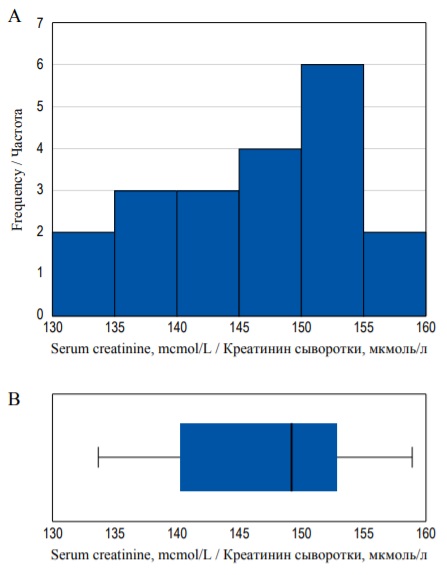
FIG. 7. Histogram (А) and box-plot (В) demonstrating the same distribution.
РИС. 7. Гистограмма (А) и диаграмма размаха (В), иллюстрирующие одно и то же распределение.
However, in some cases the whiskers can represent 1.5 × IQR above the upper quartile and 1.5 × IQR below the lower quartile, and all other values that do not fall into this range are marked as outliers. Outliers are data points that significantly differ from other observations (Fig. 8). They are usually represented as separate dots on the chart. Box-plots can be preferable to histograms when you want to present or compare the same continuous variable in several subgroups because there can be several box-plots in one figure (Fig. 8).
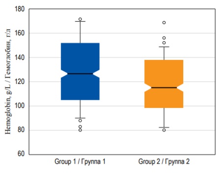
FIG. 8. Box-plots demonstrating hemoglobin median with 95% confidence interval, interquartile range, and outliers in two groups of patients.
РИС. 8. Диаграммы размаха, изображающие медиану концентрации гемоглобина c 95% доверительным интервалом, интерквартильный размах и выбросы в двух группах пациентов.
Confidence Interval
While sample mean is a point estimate (provides a single value) for the population mean, CI is an interval estimate (which provides a range of possible values). 95% confidence interval (CI) includes 95% of the values of the data sample. 95% CI is located between the 0.025 quantile and 0.975 quantile. In some texts CI is defined as a range of values that contains the true mean value (population μ) with a probability of 95%. However, a more precise but less intuitive definition of the 95% CI is the following: ‘if the level of confidence is set at 95%, it means that if data collection and analysis could be replicated many times, the CI should include within it the correct value of the measure 95% of the time’. Hence if 100 different samples are taken and a 95% CI computed for each sample, then approximately 95 of the 100 CI will contain the true population mean value (μ) [5]. Thus, CI indicates the potential random error in the sample. However, you cannot know the true value of the studied parameter in the entire population (unless you generate data to perform a complex simulation), so there is no way to check whether it really falls within the CI or not. The lengths of CI depend on the absolute sample size. In general, large sample sizes will produce smaller range 95% CI’s and vice versa. Sometimes, researchers use 99% CI located between the 0.005 and 0.995 quantiles, or 90% CI. The wider CI you use, the higher the chance that it contains the true value [6].
CI can be calculated for almost any point estimate, including median, mode, ratio, etc. For example, Figure 8 demonstrates box-plots, where ‘notches’ around the median demonstrate the 95% CI for the median.
Standard error (SE) measures the deviation of a sample statistic (point estimate) from a population statistic. SE depends on sample size and SD of a statistic. The larger the sample size and the smaller the SD, the lower the SE. If the SE is too large, the data is biased, and we cannot infer correct conclusions. In the real-life setting we rarely know the true values of the population statistics, and SE is usually calculated on the basis of point estimates.
It should be mentioned that calculation of 95% CI is usually required for hypothesis testing, and it must be reported for the values, which describe effect size in clinical research. However, it is rarely plausible to provide CI and SE for the description of initial parameters in the manuscript.
NUMERICAL AND GRAPHICAL PRESENTATION OF QUALITATIVE DATA
Traditionally, qualitative variables are presented as absolute values and frequencies (%). If the number of categories is more than two, these parameters should be reported for each category. For example: “Among 95 patients on renal replacement therapy 72 (76%) were treated with hemodialysis, 20 (21%) – with peritoneal dialysis, and 3 (3%) received kidney transplant”. If data for some patients are missing, this should also be reported.
An alternative way to report binary outcomes is odds. Odds are the ratio between the probability that the outcome will occur and the probability that the outcome will not occur. For example, in the studied group of 100 patients, 20 developed myocardial infarction and 80 did not. The probability (p) of MI is equal to: 20/100 = 0.2. The probability that MI will not occur is equal to (1 – 0.2) = 0.8. According to the definition odds are calculated as:

Thus, odds of MI are equal to 0.2/0.8 = 0.25 or ‘1 to 4’. In other words, in every five patients, one will develop MI, and four will not. Odds are rarely reported per se, but they are often used to assess the relationship between two binary variables, for example the presence (or absence) of the risk factor and outcome, by calculating odds ratio (more on that in the previous) [3].
CIs can be calculated for binominal distributions as well as for continuous. 95% CI for a proportion indicates that there is a 95% chance that this range contains the true value of the proportion of the entire population (or that in 100 random samples obtained from the population in 95 the CI will include the true value). There are several ways to calculate 95% CI for a proportion (Clopper-Pearson, Wald, modified Wald) that can be done in most of the statistical programs.
Qualitative data can be visualized using different types of diagrams, for example, bar diagrams. In bar diagrams each bar represents the frequency of each category of the variable either in absolute numbers or percentage (Fig. 9A). In contrast to histogram, bar diagrams contain gaps between different categories, and no area calculation is required to assess probability of outcomes. Another type of chart for qualitative data is pie diagram, where the whole circle represents 100% of data, and each separate segment – different categories (Fig. 9B).
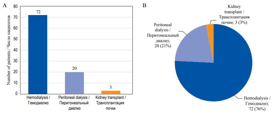
FIG. 9. Graphical representation of the qualitative data. А – Bar diagram. В – Pie diagram.
РИС. 9. Графическое представление количественных данных. А – Столбиковая диаграмма. В – Круговая диаграмма.
Sometimes it is useful to transform quantitative data into qualitative categories to demonstrate the proportion of patients that have the values within different intervals. For example, if you report glomerular filtration rate in a group of patients with kidney disease you can present not only mean ± SD, but also divide the values of this variable into several intervals that seem important and present them as categories, like <15 mL/min, 15 – 59.9 mL/min, and ≥60 mL/min. Then you can describe the proportion of patients comprising each category.
HOW TO CALCULATE AND PRESENT DESCRIPTIVE STATISTICS
While it is very important for the researcher to understand different descriptive parameters and the way they are calculated, it is not plausible to analyze the data manually. We recommend using statistical software like SPSS, Stata, R, etc., for all analyses. For example, all sample distributions and plots for continuous data in this publication were generated in R. However, there are several matters that should be taken into account to obtain adequate data and present them properly.
One of the most important practical issues, which is often overlooked by postgraduate students, is the coding of the variables. All statistical programs operate with numbers, so the database should only include variables coded as numeric values for each observation. It is easy to do it for quantitative data – one should just input the obtained values, using the identical metric scale for all observations. For example, patients’ height must be recorded either in meters or in centimeters for all patients, but you cannot use both. If the data are provided in a different scale for some observations, you must transform them before starting any other calculations. All qualitative variables should be coded in numbers, for example ‘0’ if the patient survived and ‘1’ if the patient died.
When reporting quantitative data, you should choose which parameters are the most adequate to describe your sample. Mean with SD, 95% CI, median with IQR can be calculated for most types of data distributions, but some of these parameters might be less suitable than others (despite being mathematically correct). You can (and should) calculate all these parameters during the preliminary analysis. Nevertheless, only one set of parameters is usually reported in the publication. Traditionally, it is recommended to report mean ± SD (sometimes providing minimum and maximum in the brackets) for normally distributed data. For non-normally distributed quantitative variables, median with the lower and upper quartile values (in brackets) will be more informative. Sometimes, if you report mean and SD for non-normally distributed variables the numbers might be confusing. For example, the value of SD might be larger than mean: ‘mean postoperative follow-up period was 11.8 ± 12.1 days. It seems that in some patients follow up time was negative, which is impossible in real life. In fact, these values have probably been calculated correctly, however they describe non-normally distributed variable. In this case median and IQR would be more suitable: ‘median postoperative follow-up period was 8 [ 5; 19 ] days.
Thus, it is extremely important to assess the type of distribution. In fact, there is a complex classification of distributions, but for qualitative data we usually need to decide first whether it is normal or not normal. There are several graphical and numerical methods (so called normality tests) to test this assumption: Shapiro–Wilk test, Kolmogorov–Smirnov test, Lilliefors test (a modification of the Kolmogorov–Smirnov test), Anderson–Darling test, quantile-quantile plots (Q-Q plots) and several others [7]. We do not provide any details about normality tests in this article because this is a part of inferential statistics, a special case of hypothesis testing. One of the most commonly used and powerful normality tests is Shapiro–Wilk test, which can be performed in all up-to-date statistical software [8]. Some researchers recommend Shapiro–Wilk test as the best normality test.
The normality test and parameters chosen for data description must be provided in Methods section of the publication. Always report the total number of individual observations in the sample and in each subgroup for both qualitative and quantitative data!
If you create histograms, it is important to choose an adequate number and width of bins. There are several approaches described in the literature (Sturges’ rule, Scott’s rule, Freedman and Diaconis’ rule, etc.) [9]. Some authors suggest to choose the number of bins equal to the square root of the number of observations [10].
Descriptive statistics is often presented in tables, where each row represents a variable and each column – a group of patients (table). The first column contains variable names and measurement units. The total number of observations (patients) in each group must be provided in the headers. To illustrate distribution of the parameter of interest in the first and the second group, you can provide a box-plot instead (Figure Box-plot). It should be mentioned that different statistical software utilizes various approaches to the calculation of quartiles, as a result the values of the upper and lower quartiles and the shape of box-plots might vary for the same data sets [11].
Table. Example of characteristics of the studied groups of patients
Таблица. Пример представления характеристик исследуемых групп пациентов
Group 1 / Группа 1 n = 129 | Group 2 / Группа 2 n = 131 | |
Male sex / Мужской пол, n (%) | 74 (57.4) | 68 (51.9) |
Hemoglobin, g/L / Гемоглобин, г/л | 132 ± 19 | 128 ± 17 |
Serum creatinine, mcmol/L / Креатинин сыворотки, мкмоль/л | 201.1 [ 118.4; 378.5] | 231.9 [ 126.7; 344.6] |
Примечание: качественная номинальная переменная (мужской пол) представлена в абсолютных значениях и частотах (%). Количественные переменные представлены либо как среднее ± стандартное отклонение для нормально распределенных данных, либо как медиана [Q1, Q3] для ненормально распределенных данных в обеих группах.
This tutorial covers only the most basic principles of descriptive statistics. Further details can be found in textbooks on statistics in medicine [4][6].
CONCLUSION
Similar to descriptive studies that provide basis for generating proper hypotheses and planning further research, descriptive statistics helps to understand the sampled data and lays the foundation for further inferential analysis. Every medical student, postgraduate student, doctor and researcher should be able to interpret and calculate the basic point estimates and intervals to be able to understand how the sample data relate to the general population, assess the published data properly, and provide adequate reports in their own research.
References
1. Fisher R.A. On the mathematical foundations of theoretical statistics. Philosophical Transactions of the Royal Society of London. Series A, Containing Papers of a Mathematical or Physical Character. 1922. Vol. 222. P. 309-368. https://doi.org/10.1098/rsta.1922.0009
2. Bulanov N.M., Blyuss O.B., Munblit D.B., et al. Venn diagrams and probability in clinical research. Sechenov Med J. 2020; 11(4): 5-14. https://doi.org/10.47093/2218-7332.2020.nA5-14
3. Bulanov N.M., Blyuss O.B., Munblit D.B., et al. Studies and research design in medicine. Sechenov Med J. 2021; 12(1): 4-17. https://doi.org/10.47093/2218-7332.2021.12.1A17
4. Kirkwood B., Stern J. Essential Medical Statistics. 2nd ed. Blackwell Publishing; 2003; 512 p. ISBN: 978-0-865-42871-3.
5. RothmanK. Random error and the role of statistics. Epidemiology: An Introduction. 2nd ed. Oxford University Press; 2012: 148-163. ISBN: 9780199754557.
6. MotulskyH. Intuitive Biostatistics. 4th ed. Oxford University Press; 2018; 568 p. ISBN-13: 978-0190643560. ISBN-10: 0190643560ъ.
7. Ghasemi A., Zahediasl S. Normality tests for statistical analysis: a guide for non-statisticians. Int J Endocrinol Metab. 2012 Spring; 10(2): 486-489. https://doi.org/10.5812/ijem.3505. Epub 2012 Apr 20. PMID: 23843808. PMCID: PMC3693611
8. Mohd Razali N.M., Wah Y.B. Power comparisons of Shapiro-Wilk, Kolmogorov-Smirnov, Lilliefors and Anderson-Darling tests. J Stat Model Anal. 2011; 2: 21-33.
9. Nuzzo R.L. Histograms: A useful data analysis visualization. PM R. 2019 Mar; 11(3): 309-312. https://doi.org/10.1002/pmrj.12145. Epub 2019 Mar 7. PMID: 30761760
10. Spriestersbach A., Rohrig B., Prel J.B., et al. Descriptive Statistics: The specification of statistical measures and their presentation in tables and graphs - Part 7 of a series on evaluation of scientific publications. Dtsch Arztebl. 2009; 106(36): 578-583. https://doi.org/10.3238/arztebl.2009.0578
11. Langford E. Quartiles in elementary statistics. Journal of Statistics Education. 2017; 14(3). https://doi.org/10.1080/10691898.2006.!1910589
About the Authors
N. M. BulanovRussian Federation
Nikolay M. BulanovH - Cand. of Sci. (Medicine), Associate Professor, Department of Internal, Occupational Diseases and Rheumatology, Sechenov First Moscow State Medical University (Sechenov University).
8/2, Trubetskaya str., Moscow, 119991, Tel.: +7 (919) 100-22-79
A. Yu. Suvorov
Russian Federation
Alexander Yu. Suvorov - Cand. of Sci. (Medicine), Chief Statistician, Centre for Analysis of Complex Systems, Sechenov First Moscow SMUniversity (Sechenov University).
8/2, Trubetskaya str., Moscow, 119991
O. B. Blyuss
Russian Federation
Oleg B. Blyuss - Cand. of Sci. (Phys. and Math.), Associate Professor, Department of Paediatrics and Paediatric Infectious Diseases, Sechenov First MSMU; Senior Lecturer, School of Physics, Astronomy and Mathematics, University of Hertfordshire.
8/2, Trubetskaya str., Moscow, 119991; College Lane, Hatfield, AL10 9AB
D. B. Munblit
Russian Federation
Daniil B. Munblit - PhD, Professor, Department of Paediatrics and Paediatric Infectious Diseases, Sechenov First MSMU; Honorary Senior Lecturer, Inflammation, Repair and Development Section, National Heart and Lung Institute, Faculty of Medicine, Imperial College London.
8/2, Trubetskaya str., Moscow, 119991; Exhibition Rd, South Kensington, London, SW7 2BU
D. V. Butnaru
Russian Federation
Denis V. Butnaru - Cand. of Sci. (Medicine), Vice-rector for Research.
8/2, Trubetskaya str., Moscow, 119991
M. Yu. Nadinskaia
Russian Federation
Maria Yu. Nadinskaia - Cand. of Sci. (Medicine), Associate Professor, Department of Internal Medicine Propaedeutics, Gastroenterology and Hepatology.
8/2, Trubetskaya str., Moscow, 119991
A. A. Zaikin
Russian Federation
Alexey A. Zaikin - Cand. of Sci. (Phys. and Math.), Deputy Director, Centre for Analysis of Complex Systems, Sechenov First MSMU; Professor of Systems Medicine, Institute for Women’s Health and Department of Mathematics, University College London.
8/2, Trubetskaya str., Moscow, 119991; Gower Street, London, WC1E 6BT


